Creative Direction for Slack Frontiers
🎪
Creative Direction, Event Design
💬
Client: Slack
🎪 Creative Direction, Event Design 💬 Client: Slack
We were hired to design the brand and experience for Slack’s first-ever community conference, Frontiers! There’s nothing we didn’t touch on this iconic experience.
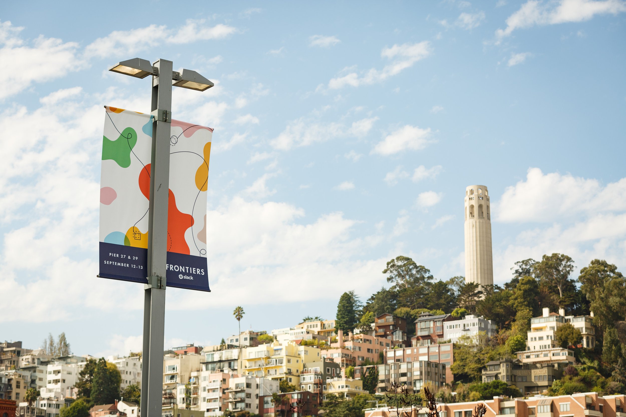
The first peek at the event brand was these pole banners greeting San Francisco neighbors and attendees.
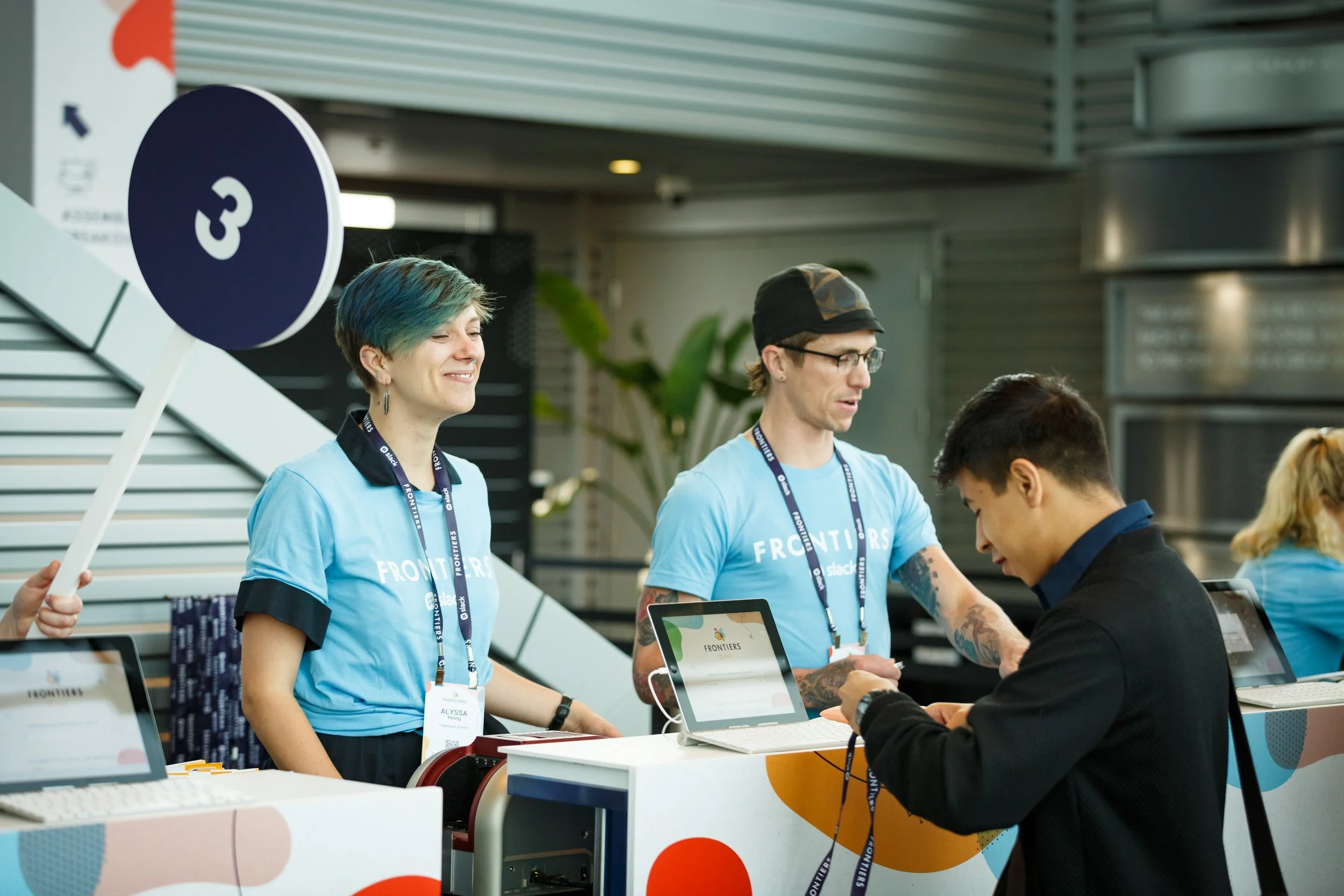
We created an engaging and vibrant experience right from the entrance leading to registration.
The registration area was packed with personality as our swag, signage, and digital registration experience shined bright for arriving attendees!
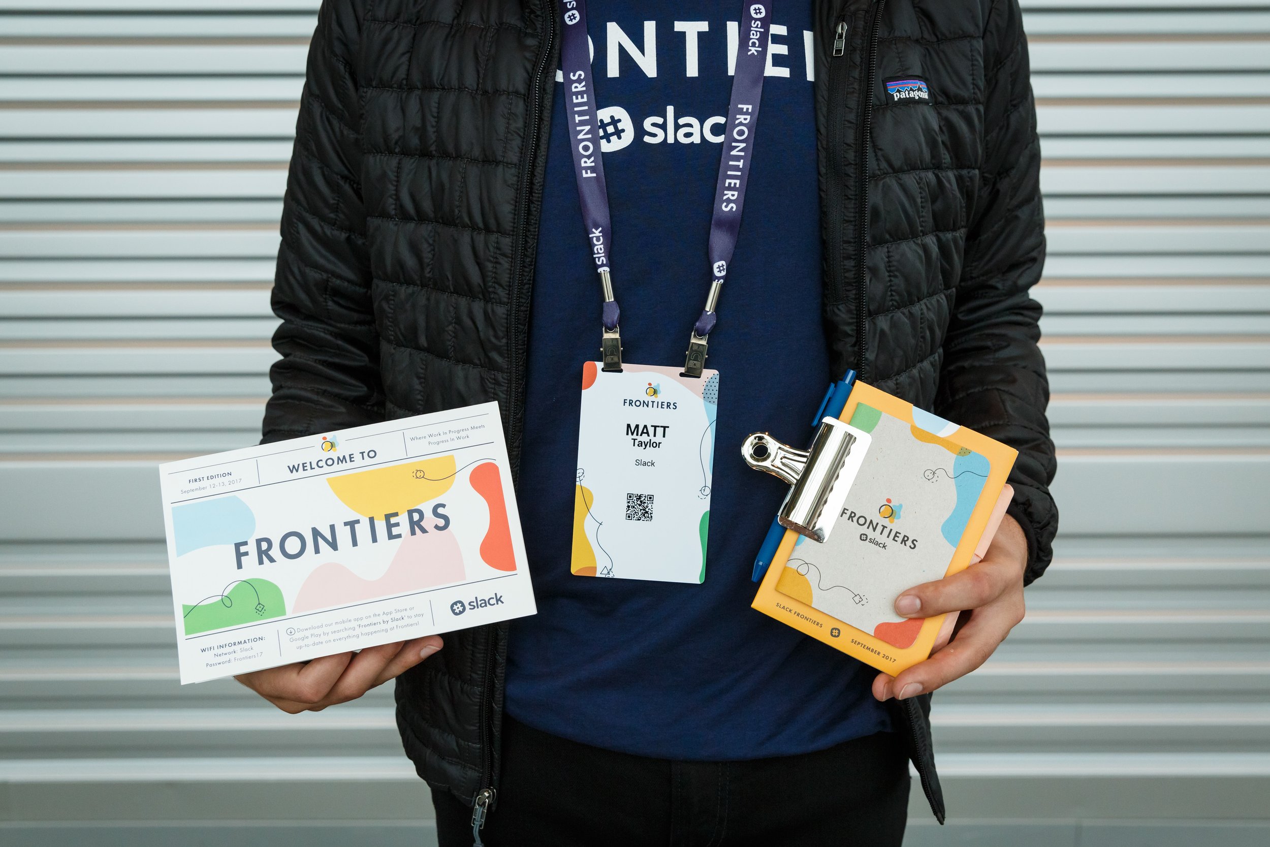
We were happy to create a low-waste suite of useful branded materials each attendee received at checkin.
As attendees navigated the indoor space, we made sure to include moments of delight to keep the energy upbeat and inspiring!
This bold energy moved throughout the partner marketplace, through break areas, and onto the stage.
We took every moment as an opportunity to load with color and bold, clean personality!
And we’re grateful for the team at Slack for facilitating joy in each detail of the Frontiers experience!
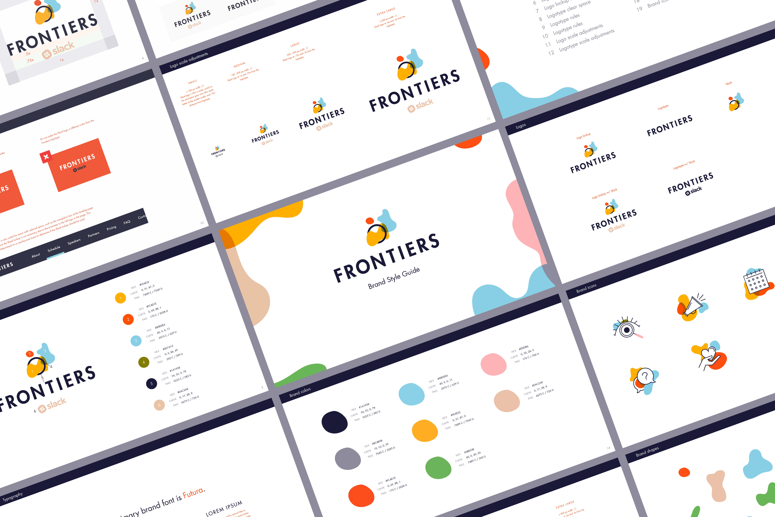
In addition to the event production design, we designed the entire brand identity system including logo and colors, marketing site, emails, social assets, and so much more!
Credits! Thanks to my team at Ghostly Ferns for working on this one with me. Ghostly Ferns is a small 4-person collective I founded back in 2009, still going strong today!
Animation by Brent Clouse!


